This React project was initiated by Professor Jiang to present his academic works. It is designed and developed by Biyun Wu.
├── README.md - This file.
├── sitemap.xml # For SEO
├── mycrawler.js # Sitemap generator.
├── package.json
├── public
│   ├── favicon.ico
│   ├── 404.html
│   ├── manifest.json #For Android.
│   └── index.html
└── src
    ├── App.css # Styles for the app, transpiled from App.scss
    ├── App.scss # Styles
    ├── App.js # This is the root of the app.
    ├── App.test.js # Used for testing. Provided with Create React App.
    ├── components # Components that constitute the app. See below for more details.
    │   ├── About.js
    │   ├── Book.js
    │   ├── Events.js
    │   ├── Papers.js
    │   ├── Home.js
    │   └── partials
    │       ├── Footer.js
    │       ├── Header.js
    │       ├── Navlinks.js
    │       └── Sidebar.js
    ├── imgs # Helpful images for the app.
    │   ├── add.svg
    │   ├── arrow-back.svg
    │   └── arrow-drop-down.svg
    ├── fonts
    ├── data
    ├── hamburgers # Burger icon.
    ├── index.css # Global styles.
└── index.jsWebpages are composed of Home, Book, Papers, Events and About components with partial components listed above. Besides, react-markdown is included for converting .markdown file to native .html.
Routes in this project is built with React Router. As the following screenshots shows, there are 6 routes in the project. The second and third routes are both associated to the Book components.
-
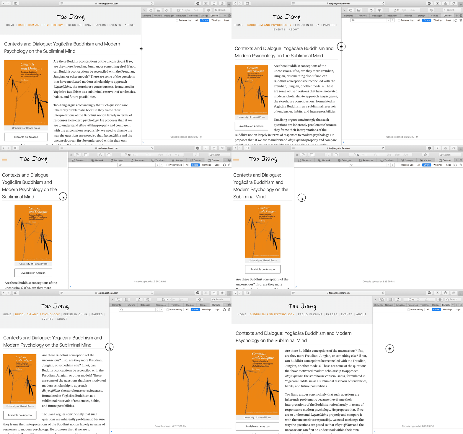
CSS Grid, Flexbox and Media Query are used to make the project responsive. As the screenshots show, the website is fully responsive on different sizes of viewports either on desktop and mobile devices.
-
Layout on iPhone Xs
In order to improve compatibility across different browsers with various versions, the project relies on react-app-polyfill and autoprefixer to transpile modern JavaScript and CSS to accommodate older browsers.
The SPA relies on react-helmet to update meta data in different routes. And the sitemap is generated through sitemap-generator.
The web analytics is implemented through react-ga.
MIT


